BAHAR — Brand Identity
A complete visual identity designed to make BAHAR recognizable across products, business materials, marketing, and digital communication.
Brand Identity Overview
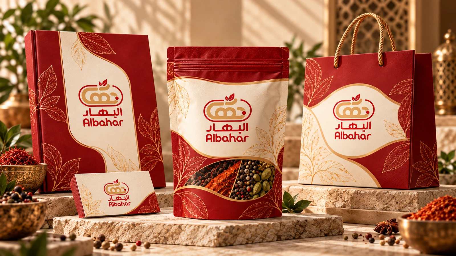
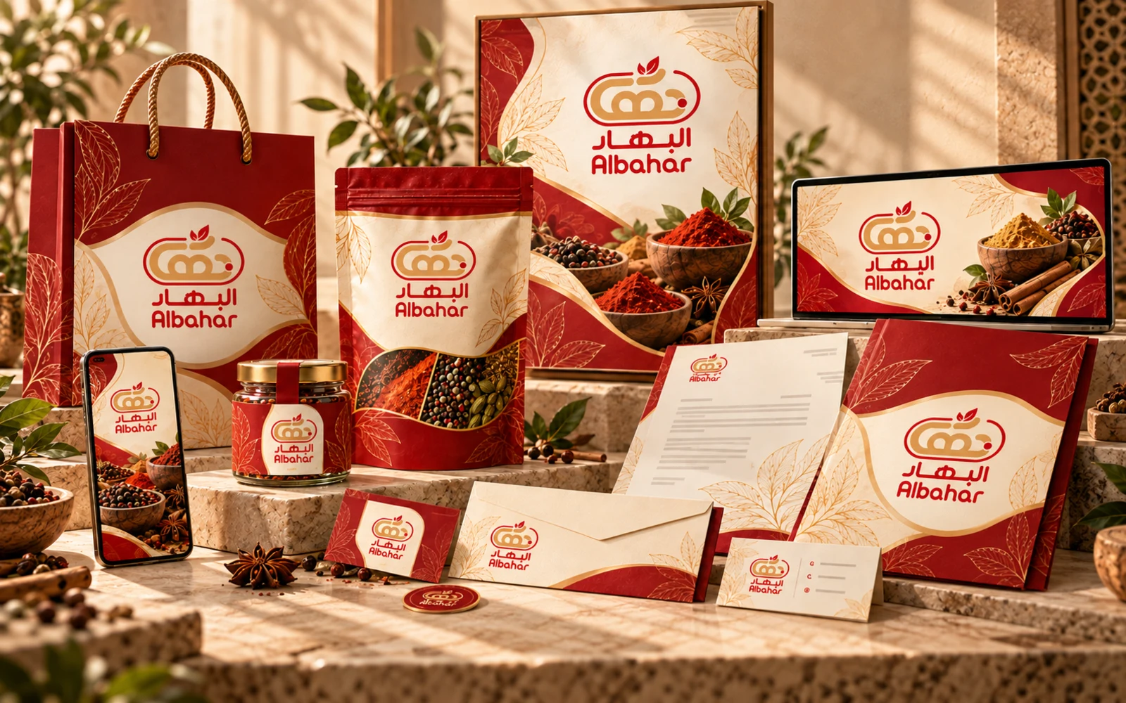
BAHAR needed to feel like a complete brand rather than a logo placed on products. The opening system brings the mark, warm red–gold–cream palette, botanical linework, packaging, and business touchpoints into one controlled visual world. This overview establishes the core promise of the identity: every application should feel recognizably BAHAR before the viewer reads a single line of copy.
Challenge
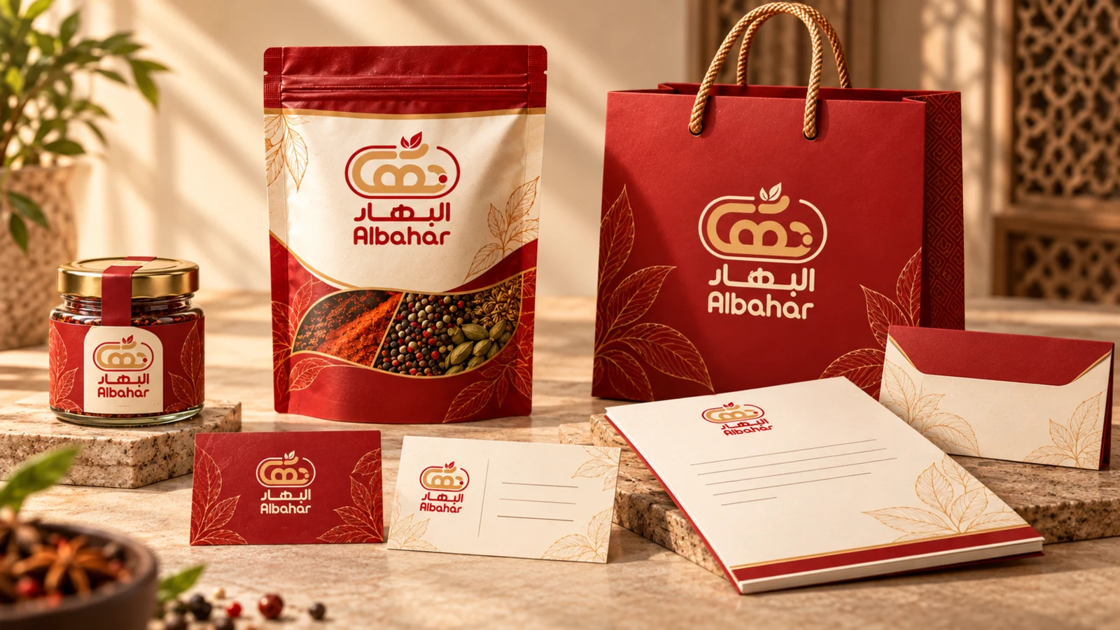
BAHAR needed an identity that could feel distinctive in a warm, product-led retail category while remaining structured enough for packaging, business documents, marketing, and digital use. The system had to go beyond a single logo and establish recognizable visual rules that could scale across very different formats.
Approach
We built the identity from a consistent core: the official mark, a red–gold–cream color language, Arabic-first typography, and a reusable botanical and curved graphic system. Those rules were then translated into product, stationery, business, marketing, and digital applications to test coherence before the system was finalized.
Logo System
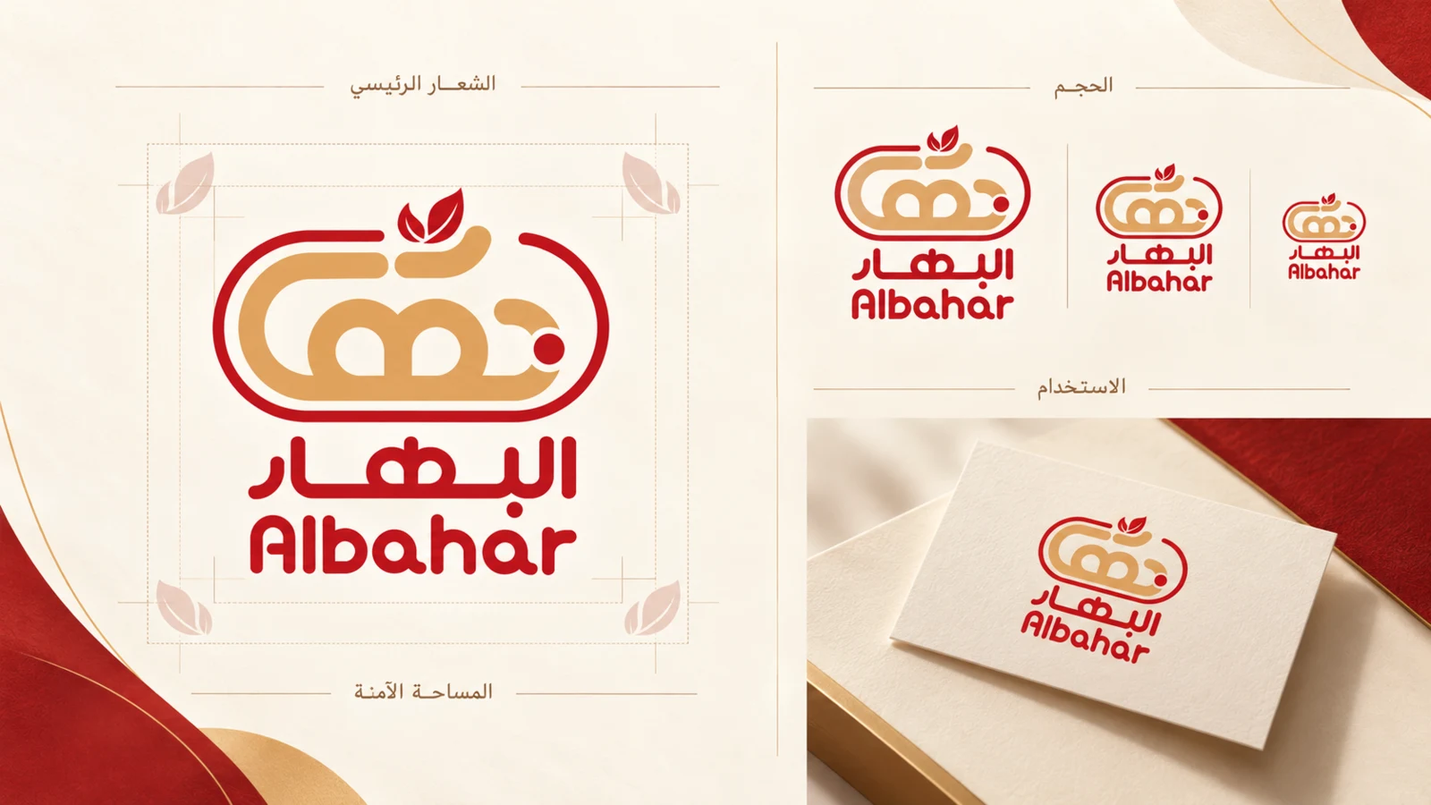
The logo is treated as a fixed visual anchor rather than a decorative element that changes from surface to surface. This section demonstrates consistent scale, clear space, and placement while preserving the official mark. The discipline around the logo gives the wider identity a stable foundation and prevents packaging, documents, and campaign materials from drifting into separate visual styles.
Color & Typography
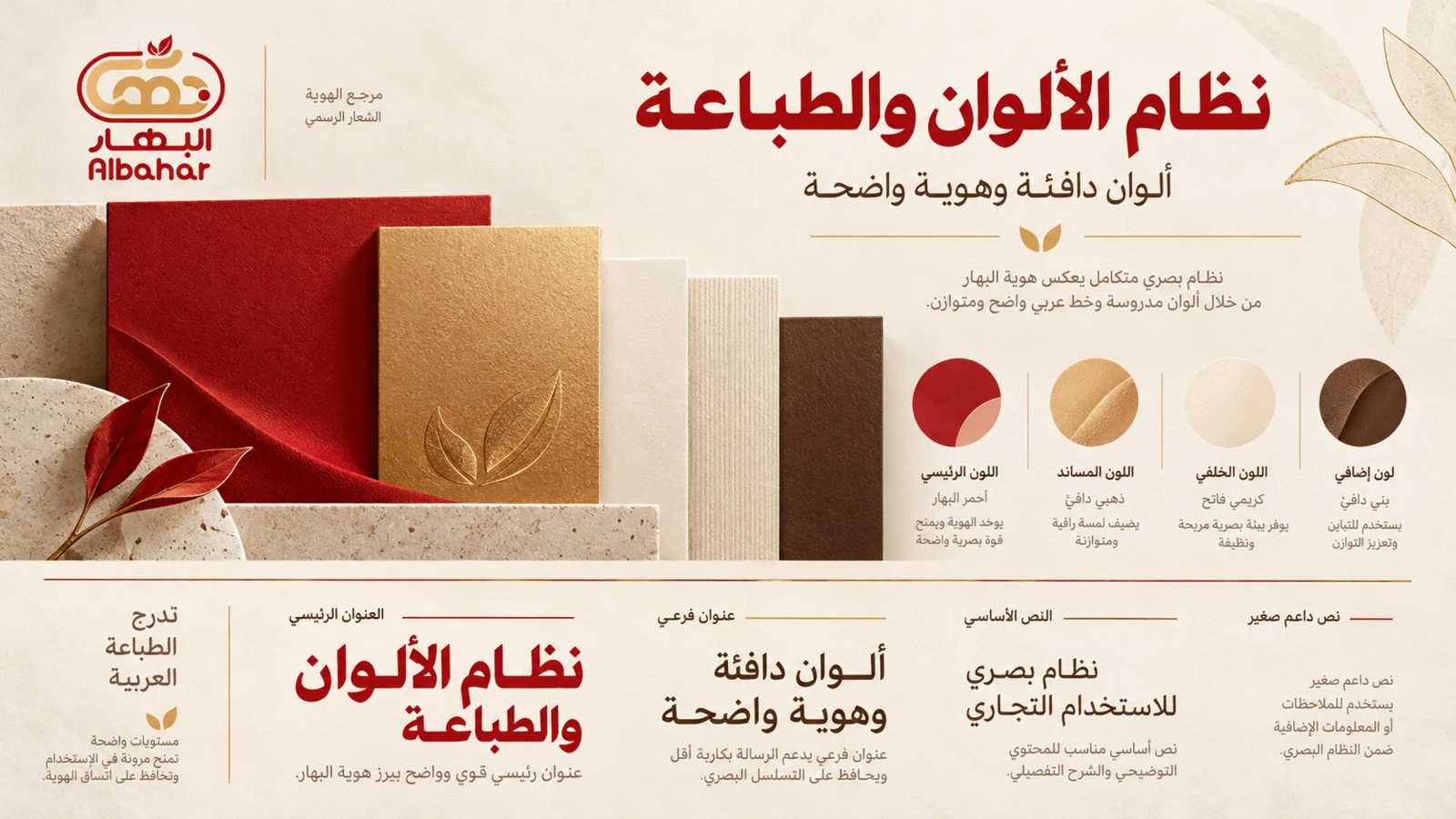
Warm cream creates breathing room, deep red carries recognition, and muted gold adds premium emphasis without overwhelming the system. Arabic typography is organized by hierarchy instead of decoration: strong headings, restrained supporting levels, and clear body text. Together, color and type create a practical system that can move between product, retail, and business communication while staying coherent.
Graphic Language
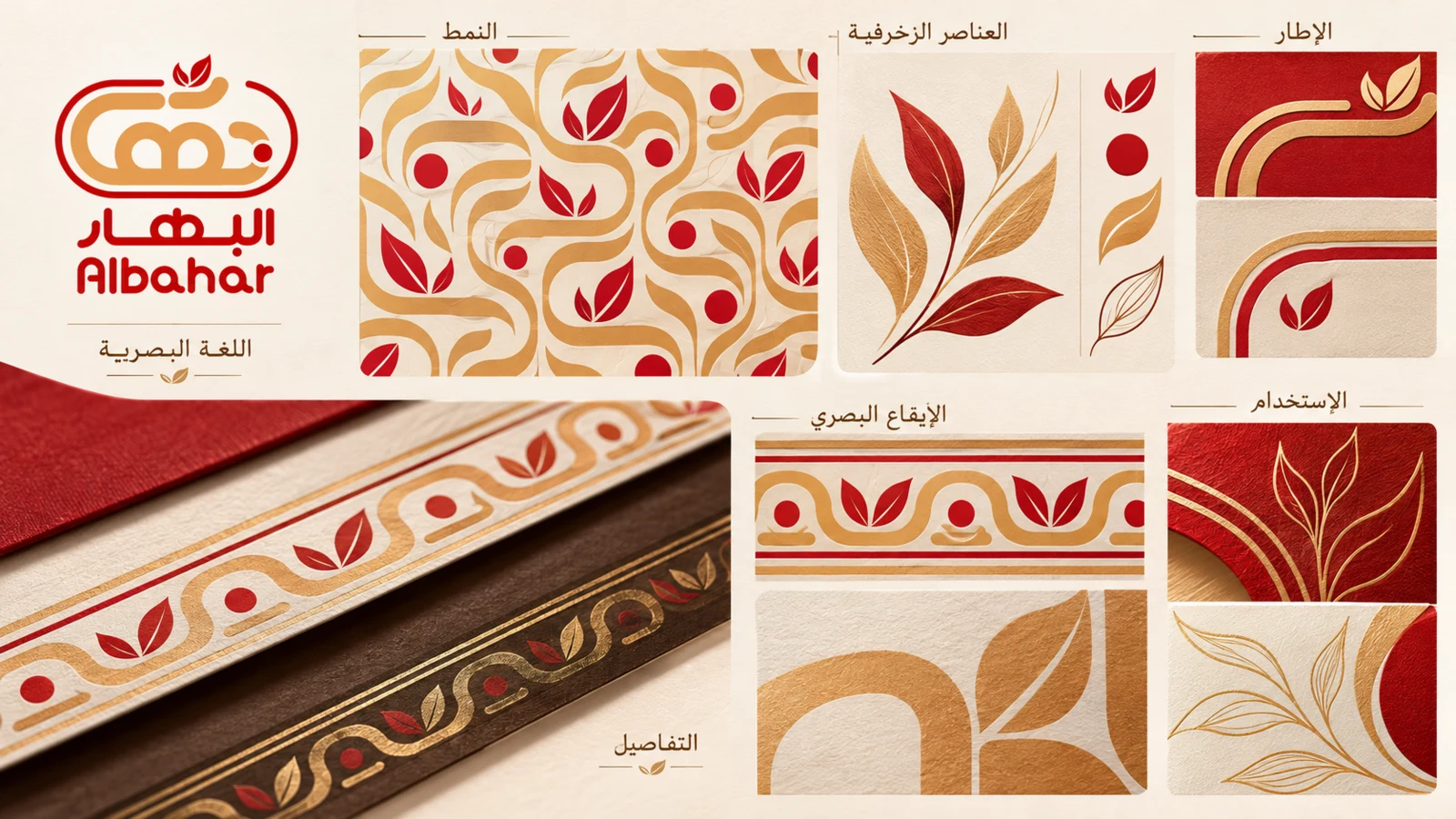
To make the brand recognizable beyond the logo, the identity uses a repeatable graphic language of botanical line art, curved frames, controlled borders, and warm material textures. These elements can expand, crop, and repeat across surfaces without becoming ornamental noise. The result is a flexible visual rhythm that links packaging, stationery, and marketing while keeping BAHAR distinctive.
Business & Brand Applications
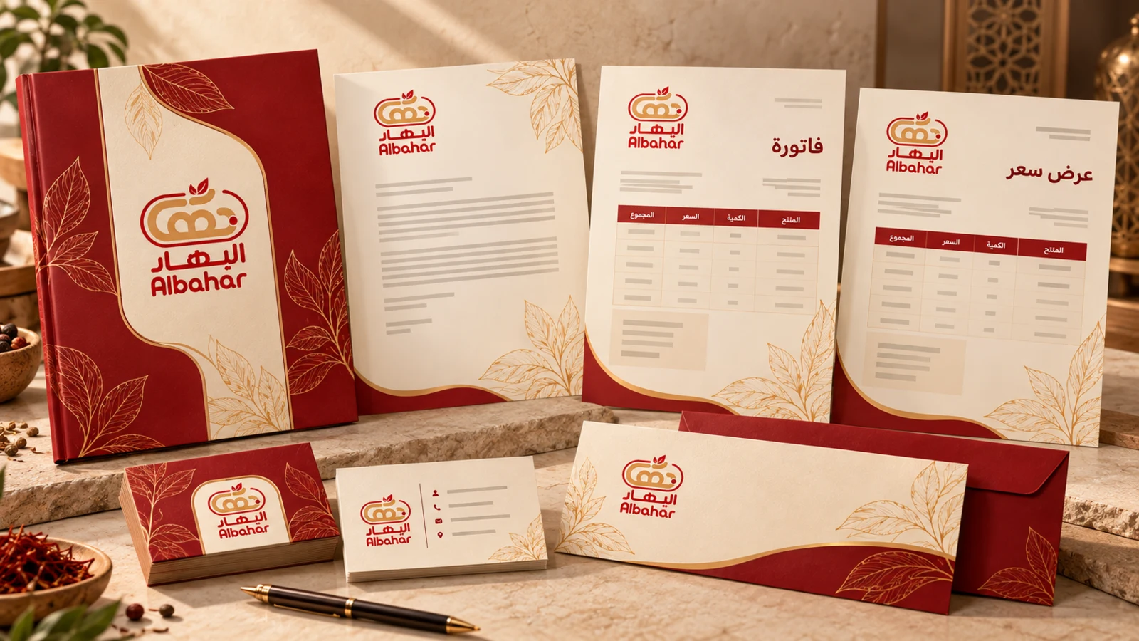
A brand system is only useful if it works in everyday operations. The identity is applied to Arabic-first business materials including invoice and quotation layouts, letterhead, folder, envelope, and business cards. The applications share the same logo discipline, color hierarchy, and botanical framing, showing how BAHAR can remain consistent across practical administrative and customer-facing touchpoints.
Digital & Marketing Brand Applications
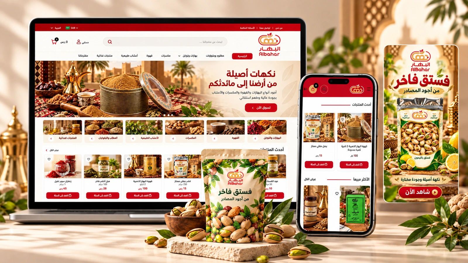
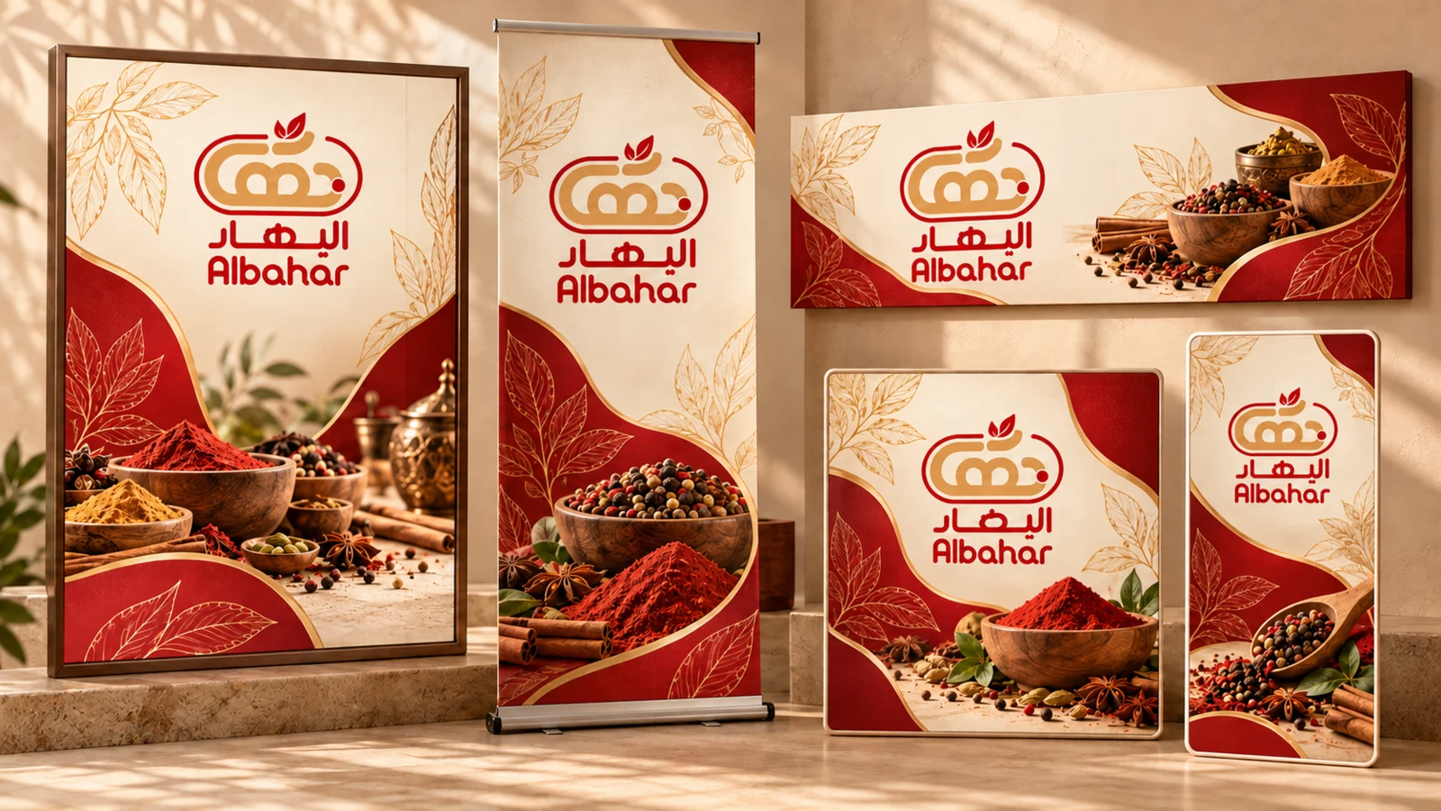
The same identity extends into promotional and digital formats without becoming a separate campaign style. Poster, display, banner, and mobile formats reuse the established palette, logo discipline, and botanical framing. This section demonstrates adaptability across scale and aspect ratio while keeping the visual language recognizable and avoiding dependence on a single template.
Final Brand Ecosystem
The closing showcase brings product, retail, business, marketing, and digital applications into one ecosystem. Rather than introducing new styling, it demonstrates how the same rules continue to hold across different materials and contexts. The result is a coherent brand world that can support BAHAR as the business grows without losing visual recognition.
Outcome
The result is a coherent brand system that can move from packaging and retail materials to documents, campaigns, and digital communication without losing recognition. The project establishes a clear visual foundation for BAHAR and provides a scalable language for future applications.